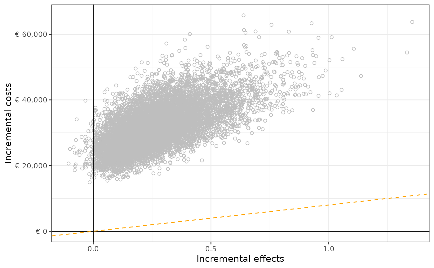
This function plots the incremental cost-effectiveness plane for two strategies.
Usage
plot_ice(
  df,
  e_int,
  e_comp,
  c_int,
  c_comp,
  col = NULL,
  n_it = NULL,
  wtp = NULL,
  currency = "euro",
  axes = TRUE
)
Arguments
- df
a dataframe.
- e_int
character. Name of variable of the dataframe containing total effects of the intervention strategy.
- e_comp
character. Name of variable of the dataframe containing total effects of the comparator strategy.
- c_int
character. Name of variable of the dataframe containing total costs of the intervention strategy.
- c_comp
character. Name of variable of the dataframe containing total costs of the comparator strategy.
- col
character. Name of variable of the dataframe to use to colour (in blue) the plotted dots. Default is NULL which results in grey dots.
- n_it
(vector of) numeric value(s). Designate which iteration should be coloured in the colour red.
- wtp
numeric. Default is NULL. If different than NULL, plots a linear line with intercept 0 and the defined slope.
- currency
character. Default is "euro". Determines the currency sign to use in the incremental cost effectiveness plane. Currently included signs: "euro", "dollar", "yen", "none".
- axes
logical. Default is TRUE, axes are plotted at x = 0 and y = 0. If FALSE, no axes are plotted.
Examples
# Generating plot using the example dataframe, and a willlingness-to-pay threshold of 80,0000 euros.
data(df_pa)
plot_ice(df = df_pa,
         e_int = "t_qaly_d_int",
         e_comp = "t_qaly_d_comp",
         c_int = "t_costs_d_int",
         c_comp = "t_costs_d_comp",
         wtp = 8000,
         currency = "none")